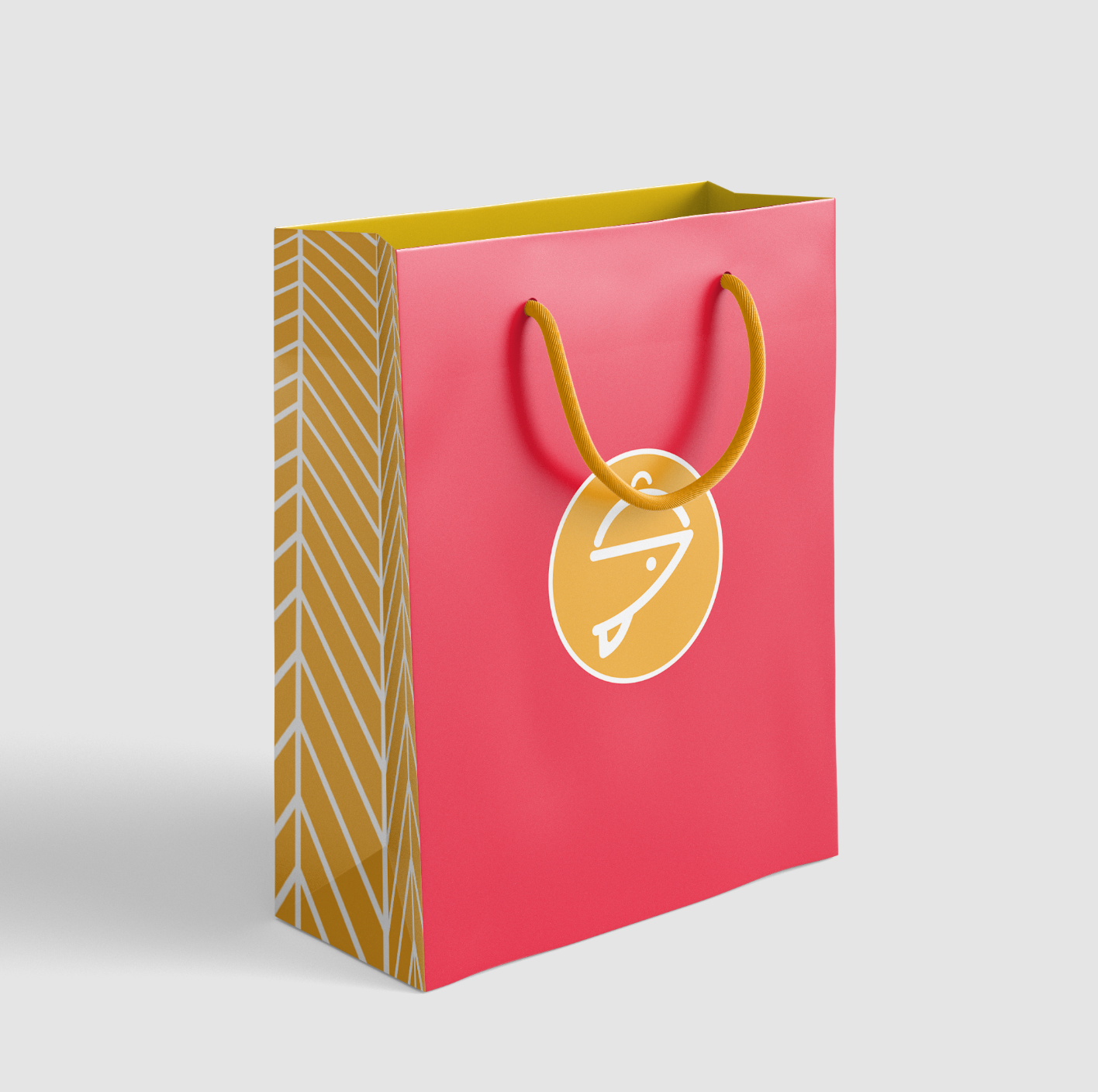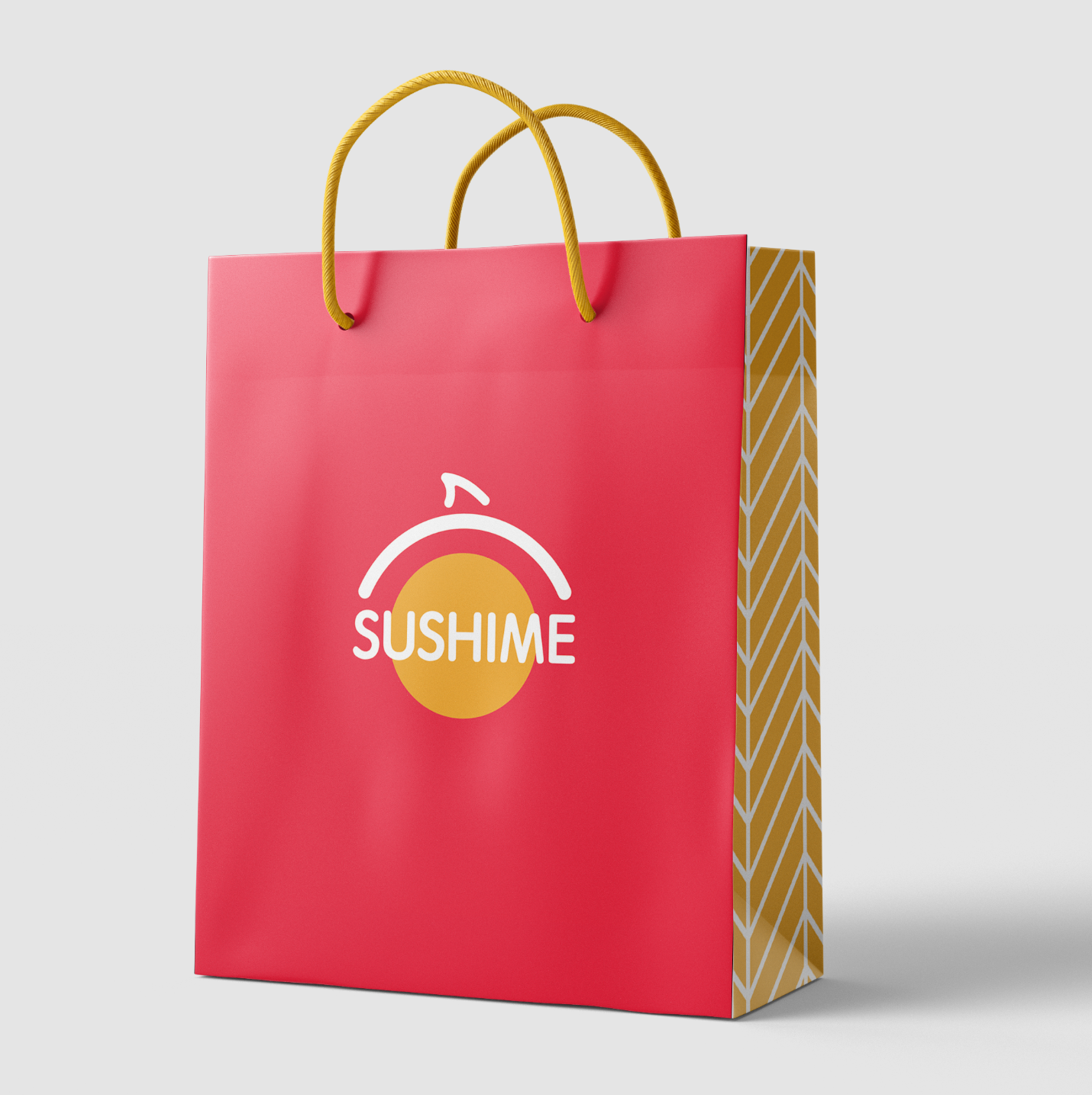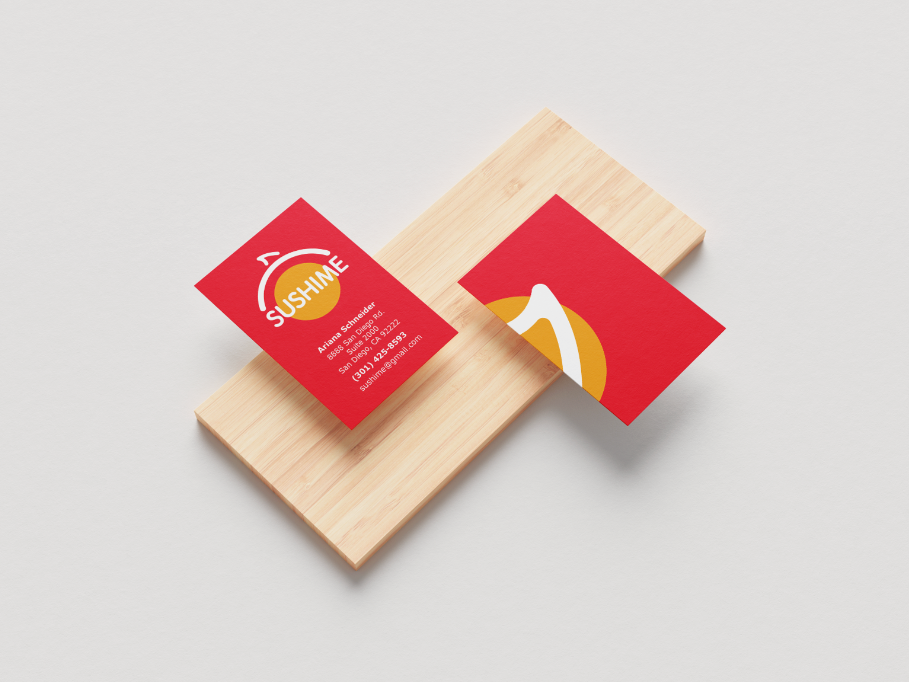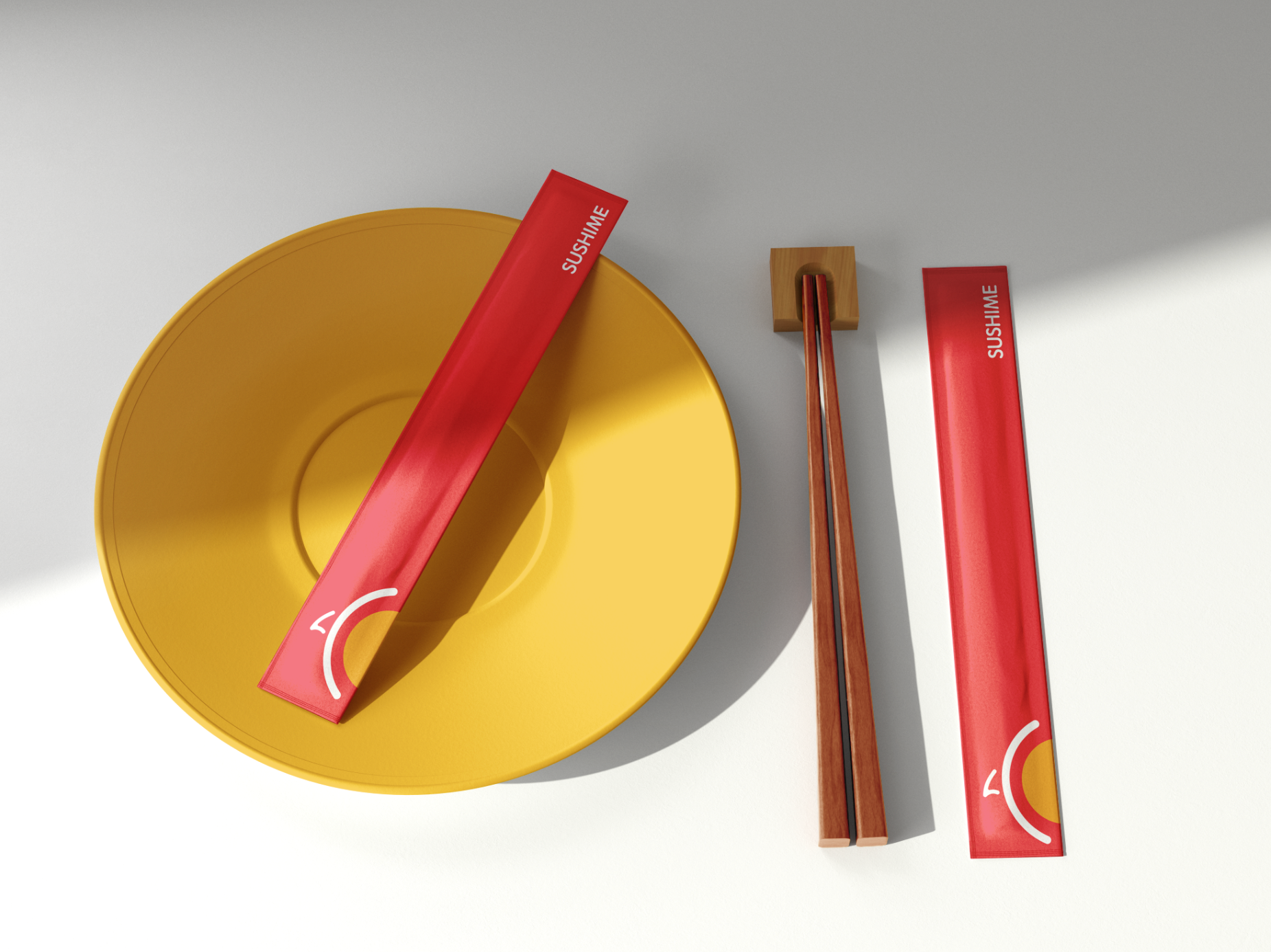
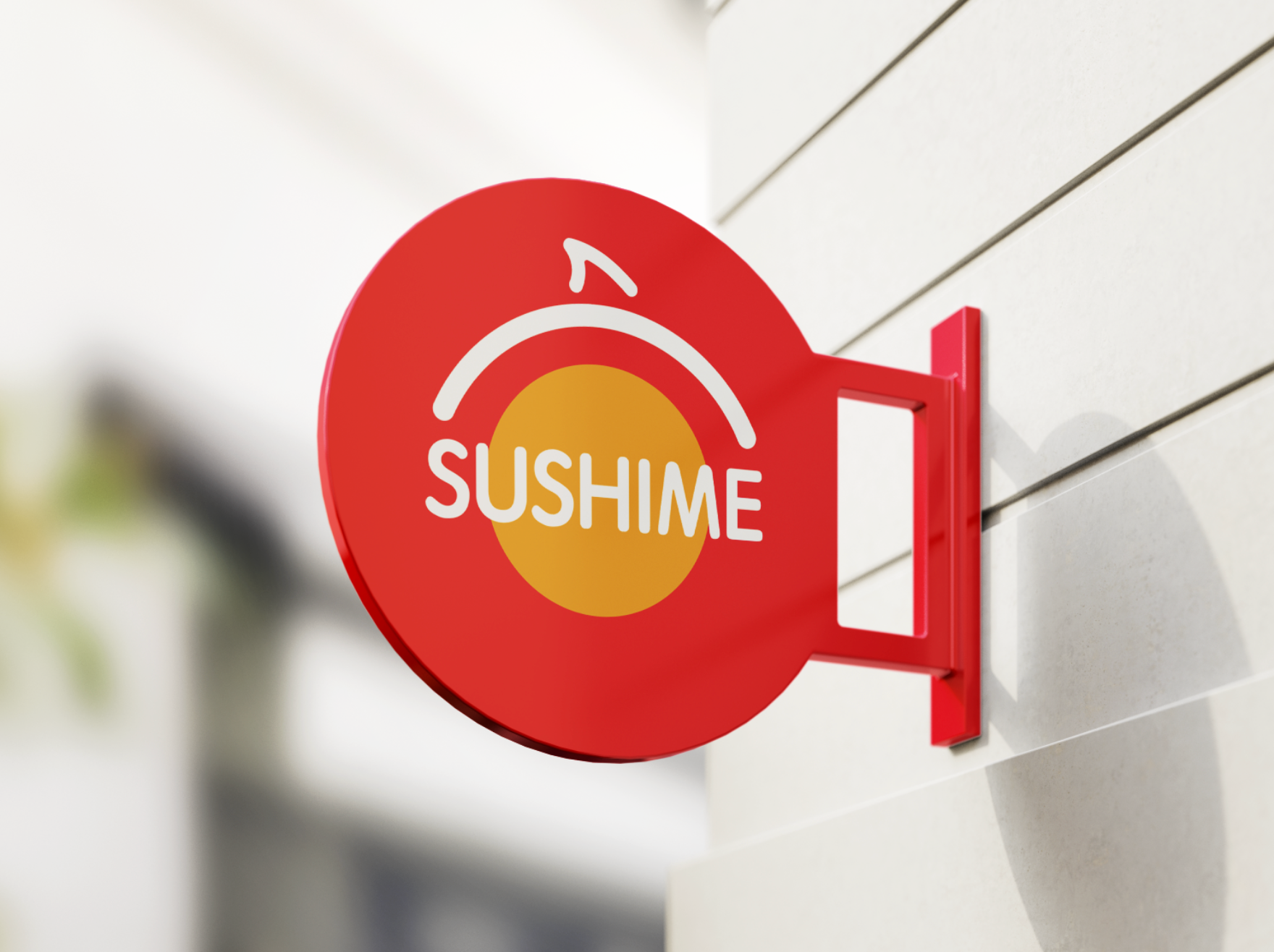
This project navigated the exploration of abstract brand development using professional research and application. Having much restaurant experience myself, my project centered around the formation of a sushi house named “Sushime” — a play on the word Sashimi. In the formative aspects of my design process, I constructed a narrative behind my design and centered my research on abstract forms relating to the brand aesthetic and the companies visual communication needs. I focused on the ideas of representing this logo using organic forms and common visuals. My choices of color reflect earths natural tones while also feeling fresh and modern. The graphic translation of the font was changed from initial hard edges to rounded ones to give the design a cohesive look and organic feel. I then used this logo to create visual representation of application in a real life setting.
PROCESS

PACKAGING